Python 可視化神器Plotly詳解

文 | 潮汐
來源:Python 技術「ID: pythonall」
學習Python是做數分析的最基礎的一步,數據分析離不開數據可視化。Python第三方庫中我們最常用的可視化庫是 pandas,matplotlib,pyecharts, 當然還有 Tableau,另外最近在學習過程中發現另一款可視化神器-Plotly,它是一款用來做數據分析和可視化的在線平臺,功能非常強大, 可以在線繪制很多圖形比如條形圖、散點圖、餅圖、直方圖等等。除此之外,它還支持在線編輯,以及多種語言 python、javascript、matlab、R等許多API。它在python中使用也非常簡單,直接用pip install plotly 安裝好即可使用。本文將結合 plotly 庫在 jupyter notebook 中來進行圖形繪制。
使用 Plotly 可以畫出很多媲美Tableau的高質量圖,如下圖所示:

折現點圖畫圖步驟如下:首先在 Pycharm 界面輸入 jupyter notebook后進入網頁編輯界面,新建一個文件,導入相應的包即可進行圖形繪制:
# import pkgfrom plotly.graph_objs import Scatter,Layoutimport plotlyimport plotly.offline as pyimport numpy as npimport plotly.graph_objs as go
#設置編輯模式plotly.offline.init_notebook_mode(connected=True)
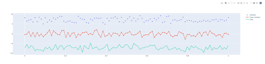
#制作折線圖N = 150random_x = np.linspace(0,1,N)random_y0 = np.random.randn(N)+7random_y1 = np.random.randn(N)random_y2 = np.random.randn(N)-7 trace0 = go.Scatter( x = random_x, y = random_y0, mode = ’markers’, name = ’markers’)trace1 = go.Scatter( x = random_x, y = random_y1, mode = ’lines+markers’, name = ’lines+markers’)trace2 = go.Scatter( x = random_x, y = random_y2, mode = ’lines’, name = ’lines’)data = [trace0,trace1,trace2]py.iplot(data)
顯示結果如下:
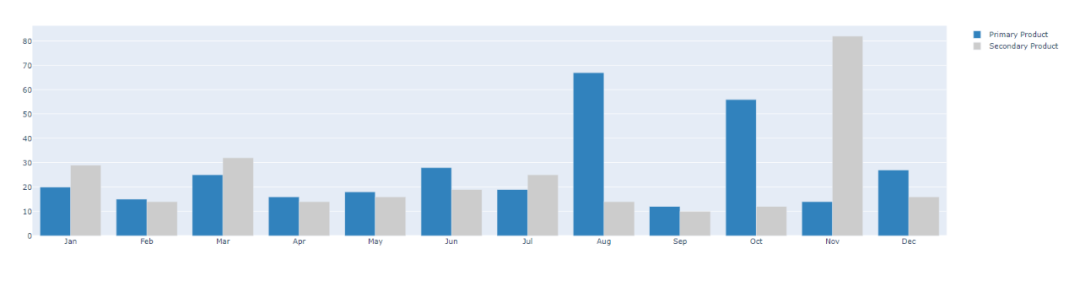
# 直方圖trace0 = go.Bar( x = [’Jan’,’Feb’,’Mar’,’Apr’, ’May’,’Jun’, ’Jul’,’Aug’,’Sep’,’Oct’,’Nov’,’Dec’], y = [20,15,25,16,18,28,19,67,12,56,14,27], name = ’Primary Product’, marker=dict( color = ’rgb(49,130,189)’ ))trace1 = go.Bar( x = [’Jan’,’Feb’,’Mar’,’Apr’, ’May’,’Jun’, ’Jul’,’Aug’,’Sep’,’Oct’,’Nov’,’Dec’], y = [29,14,32,14,16,19,25,14,10,12,82,16], name = ’Secondary Product’, marker=dict( color = ’rgb(204,204,204)’ ))data = [trace0,trace1]py.iplot(data)
顯示結果如下:
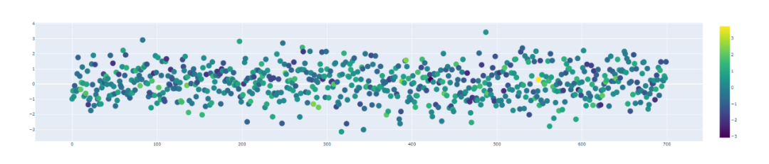
散點圖
# 散點圖trace1 = go.Scatter( y = np.random.randn(700), mode = ’markers’, marker = dict( size = 16, color = np.random.randn(800), colorscale = ’Viridis’, showscale = True ))data = [trace1]py.iplot(data)
顯示結果如下:
今天的文章主要學習可視化神器-plotpy 的相關操作,希望在平時的工作中有所應用。更多的內容詳見 https://plotly.com/python/
到此這篇關于Python 可視化神器Plotly詳解的文章就介紹到這了,更多相關Python 可視化神器Plotly內容請搜索好吧啦網以前的文章或繼續瀏覽下面的相關文章希望大家以后多多支持好吧啦網!
相關文章:
 網公網安備
網公網安備